"Can you match our brand blue?" is a simple question with a technical answer. Yes — but only if you tell us which blue, in a language that means the same thing on every screen and in every factory. That language is Pantone.
Here is how colour matching on wristbands actually works, why screen approval is unreliable, and what to supply so the bands arrive the colour you expected.
Why "our blue" is not a specification
Every screen renders colour differently. Panel technology, brightness, colour profile and age all shift what you see. The blue you approve on a calibrated design monitor is a different blue on a laptop in a bright office, and different again on a phone.
Send a picture of your logo and ask for "this blue" and somebody has to interpret it. They will do their best, and the result may be a shade off — at which point nobody can prove what was agreed, because the reference was a rendering rather than a standard.
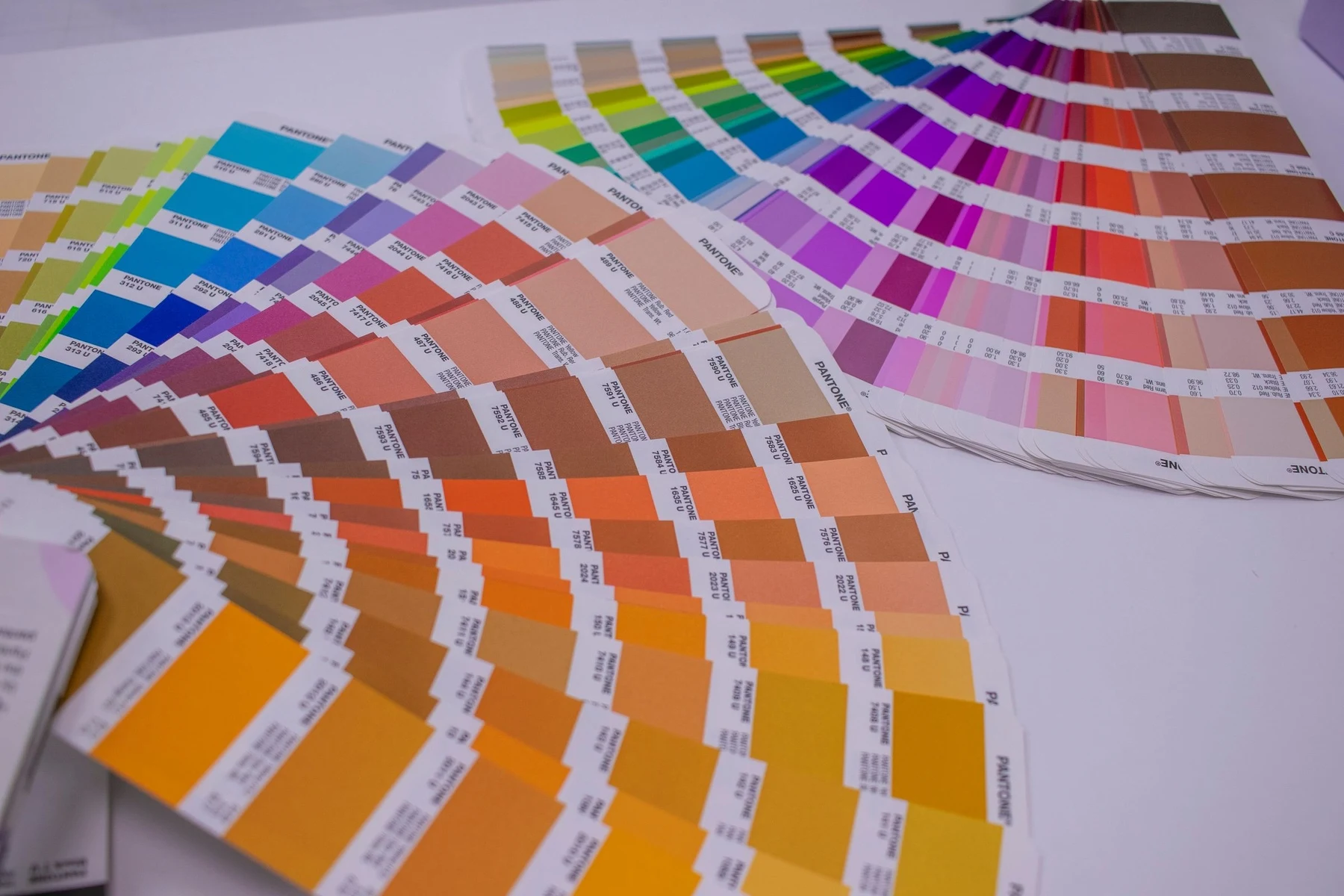
A Pantone number removes interpretation. It refers to a physical, standardised ink colour that is identical everywhere in the world.
What Pantone actually is
The Pantone Matching System is a catalogue of standardised colours, each with a unique reference. Designers, printers and manufacturers all work from the same physical swatch books, so "Pantone 286 C" means precisely one colour regardless of who reads it or what screen they are looking at.
Most brands with a style guide already have Pantone references recorded. If yours does, that document is what to send — not a logo file, not a screenshot.
Coated and uncoated
You will see references ending in C or U — coated and uncoated paper. The same ink looks different on glossy and matte stock, so Pantone publishes both. For silicone, the C value is the usual starting point because moulded silicone has a smoother surface, but tell us which you have and we will work from it.
How close a match is achievable
Honestly: very close, not always identical, and the reason is physics rather than effort.
Pantone colours are defined as ink on paper. A wristband is pigment mixed through silicone, which is a translucent material with its own optical behaviour. Light enters the surface, scatters and comes back out, which is why silicone has a slight depth to its colour that flat ink does not.
For the great majority of colours the match is close enough that nobody notices a difference. Where it gets harder is with very bright fluorescents, metallics and pastels — fluorescent inks rely on effects that pigment in silicone reproduces differently, and metallics have no real silicone equivalent at all.
Matching a brand palette?
Send your Pantone references and we will confirm what is achievable before you order. Browse branded wristbands or custom silicone wristbands.
Send your Pantone references and we will confirm what is achievable before you order. Browse branded wristbands or custom silicone wristbands.
Matching the band and the message separately
A wristband usually has two colours to specify, and they are produced differently.
The band colour
Pigment mixed into the silicone before moulding. This is where Pantone matching happens and where the small optical difference described above applies.
The message colour
On a colour-filled debossed band or a printed band, this is ink. Ink matches Pantone more directly than pigment does, so message colour is usually the closer match of the two.
Specify both. Orders where only the band colour was given routinely come back with a message in a default colour that nobody chose.
If you do not have a Pantone reference
Plenty of organisations do not, and there are workable alternatives.
Send a physical sample. A printed brochure, a uniform, an existing band — anything physical can be matched against a swatch book. This is more reliable than any digital file.
Give us a CMYK or RGB value. Not as precise, but far better than a description. We can convert to the nearest Pantone and confirm it with you.
Pick from standard colours. If the colour is not brand-critical, choosing from the standard range is cheaper and faster than a custom match, because there is no matching step at all.
Practical advice before you order
Ask what the standard range already covers. Your colour may be close enough to a stock colour that custom matching adds cost for no visible gain.
Allow extra time. Custom matching adds a step, and if the date is tight it may be the thing that makes it impossible — see the express range for comparison.
Keep the reference for next time. Record the Pantone numbers used so the reorder in twelve months matches the first run. Colours drifting between batches is almost always a paperwork failure rather than a production one.
Judge the proof by the numbers, not the picture. Read the Pantone references printed on the proof against the ones you supplied. Judging colour by how a proof looks on your screen reintroduces the exact problem Pantone solves.
Frequently asked questions
Can you Pantone match a silicone wristband?
Yes. Supply the Pantone reference and the pigment is mixed to match it. The result is very close for the great majority of colours, with fluorescents, pastels and metallics the hardest to reproduce exactly because silicone behaves differently to ink on paper.
What if I do not know my Pantone number?
Send a physical sample — a brochure, a uniform, an existing band — and it can be matched against a swatch book. A CMYK or RGB value also works as a starting point. Both are far more reliable than describing the colour or sending a screenshot.
Why does my wristband look slightly different to the Pantone swatch?
Pantone defines ink on paper, while a wristband is pigment in translucent silicone. Light scatters within the material, giving silicone a slight depth that flat ink does not have. For most colours the difference is imperceptible.
Should I use coated or uncoated Pantone references?
The coated value is the usual starting point for silicone because the moulded surface is smooth. If your brand guide specifies uncoated, send that — what matters is telling us which one you are working from so there is no ambiguity.
Does Pantone matching cost extra?
Custom matching adds a step to production, so it costs more and takes longer than choosing from standard colours. If the colour is not brand-critical, a close stock colour is often the better value choice.
Keeping colour consistent across reorders
The most common colour complaint is not that the first run was wrong — it is that the second run does not match the first.
That almost always traces to record-keeping rather than production. If the original order was matched from a sample or an approved proof rather than a recorded Pantone number, the reorder has nothing precise to match against, so it is matched again from scratch and lands slightly differently.
The fix is simple and worth doing once. When an order is approved, write down the exact Pantone references for band and message and keep them with your brand assets, not in an email thread. Quote them on every subsequent order.
Keeping a physical band from each run helps too. A sample in a drawer is a reference anyone can check against, and it settles questions that a screen never will.
Order colour-matched wristbands
- Branded wristbands — corporate palette matching
- Custom silicone wristbands — full colour range
- School wristbands — house colours matched accurately
- Event wristbands — colour-coded access sets
Send your Pantone references and we will confirm the match before production. Designed in Sydney, shipped Australia-wide.

Written by
Founder, Handband
Founder of Handband; specialist in custom wristbands and promotional products for events, schools, charities, and brands.
← Previous
Plan For Purple Heart Home In Glastonbury Progressing
Next →
Custom Wristbands for Home & Garden Show Exhibitors
Comment(s)