Most wristband orders that arrive looking wrong were not manufactured wrong. They were approved wrong, from artwork that could never have produced what the customer pictured. Getting the file right at the start removes almost every unpleasant surprise later.
This is what to send, what to avoid, and how to read a proof properly before you approve a run of a thousand bands.
Send vector artwork wherever possible
Vector files — EPS, AI, or a PDF saved with vector content intact — describe your logo as shapes and curves rather than pixels. They can be scaled to any size without losing definition, which matters because your logo may need to render at 12mm on a band and at poster size on a proof.
A logo saved from a website is typically 72dpi and a few hundred pixels wide. Enlarged to band size it goes soft, and soft artwork cut into a mould produces mushy letterforms. If vector genuinely does not exist, send the largest, cleanest raster you have — an original 300dpi file, not a screenshot and not something pulled from social media.
Convert type to outlines
Fonts do not travel inside most files. If the artwork is opened on a machine without your font installed, the software substitutes something else, and your carefully chosen typeface silently becomes Arial.
Converting text to outlines turns each letter into a shape, so the letterforms you approved are the letterforms produced. Do it on a copy — once outlined, the text is no longer editable, so keep your working file intact.
Simplify for the process you have chosen
Different finishes have different tolerances, and artwork that is wrong for the process is the most common cause of a disappointing result.
For debossed and embossed bands
The message is formed in silicone, which means shape only — no gradients, no shadows, no tonal variation. Thin strokes and small point sizes lose definition because the material softens fine detail. Strip the artwork back to solid shapes with reasonable stroke weight before you send it.
For printed bands
Far more forgiving. Gradients, fine type and multi-colour logos all reproduce. The constraint moves from detail to durability — see the difference between the silicone finishes available before you decide.
For colour-filled debossing
The recess is moulded and then filled, so the shape rules of debossing apply, but you gain contrast. Keep fillable areas reasonably sized — very fine recesses are difficult to fill cleanly.
Not sure your logo will work?
Send it over and we will tell you honestly what it needs before you commit to a run. Browse custom silicone wristbands or the branded range.
Send it over and we will tell you honestly what it needs before you commit to a run. Browse custom silicone wristbands or the branded range.
Specify colour properly
"Our blue" is not a specification. Screens vary enormously in calibration, so the colour you approve on your monitor is not the colour someone else sees on theirs.
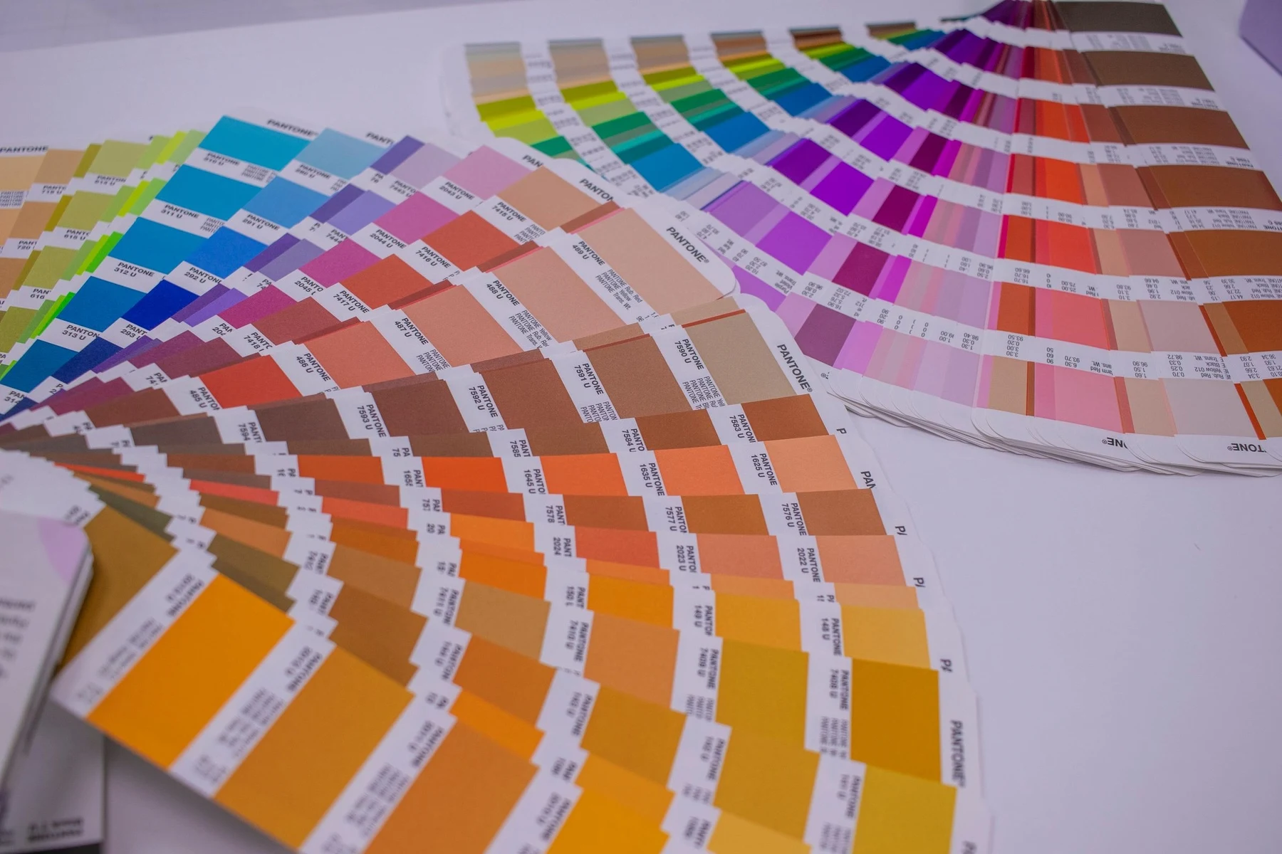
Supply a Pantone reference for both the band colour and any ink. If you do not have one, say what you are matching to — a uniform, an existing band, a printed brochure — and we can work from a physical sample instead. Working from a described colour is how a run comes back a shade off and nobody can say who was wrong.
Think about the layout, not just the logo
A wristband is a long thin canvas that wraps around a wrist, which is an unusual shape to design for.
The message repeats
On most bands the message is repeated around the circumference so it is readable from any angle. That changes how much unique content you can have — a long message repeated twice may be more effective than a very long message that only appears once.
The usable area is smaller than the band
Part of the circumference is taken up by the closure region. On an adult band, plan for roughly 150–160mm of usable face rather than the full loop.
Width sets the type size
A layout designed for a 19mm band will not simply shrink onto a 6mm one. If you are ordering multiple widths, expect the artwork to be adjusted for each rather than scaled.
Read the proof properly
The proof is your last chance to catch something cheaply, and it deserves more than a glance.
Check the spelling, then check it again. Have someone who did not write the copy read it. A misspelling caught on a proof costs nothing; caught on delivery it costs the whole run.
Confirm the band size and width shown. Proofs are often presented at a comfortable viewing size. Confirm which physical width and circumference it represents.
Check any phone number or web address character by character. These are the fields people skim and they are the ones that make a band useless if wrong.
Confirm the colour references. Read the Pantone numbers on the proof against the ones you supplied rather than judging by how the proof looks on screen.
Common artwork mistakes
Sending a logo with a white background. On a coloured band a white box around your logo is very visible. Supply transparent artwork or say clearly which parts should not print.
Assuming a drop shadow will survive. It will not on a moulded band. Decide in advance whether it is removed or the finish changed.
Forgetting the message wraps. A design with a clear left and right edge can look odd when it meets itself around the wrist.
Approving in a hurry. Almost every reprint traces back to an approval given in under a minute.
Frequently asked questions
What file format should I send for wristband artwork?
Vector wherever possible — EPS, AI, or a PDF with vector content intact. These scale to any size without losing definition. If vector is unavailable, send the largest high-resolution raster you have rather than a web image or screenshot.
Why do I need to convert text to outlines?
Fonts do not travel with most files. Without outlining, software on another machine substitutes a different typeface and your design changes silently. Outlining turns letters into shapes so what you approved is what gets produced. Keep an un-outlined working copy.
Can I have a gradient or photo on a wristband?
Only on printed bands. Moulded finishes such as debossing and embossing produce shape rather than tone, so gradients, shadows and photographic elements cannot reproduce. If the artwork needs them, printing is the process to choose.
How do I specify the exact colour I want?
Give a Pantone reference for the band and any ink. Describing a colour or approving it on screen is unreliable because monitors vary. Without a Pantone number, tell us what you are matching and we will work from a physical sample.
What should I check on the proof?
Spelling, checked by someone who did not write the copy. The width and circumference it represents. Every character of any phone number or web address. And the Pantone references written on the proof, rather than judging colour by how it looks on your screen.
Send us your artwork
- Custom silicone wristbands — debossed, embossed, printed and colour-filled
- Branded wristbands — logo reproduction and Pantone matching
- Fabric wristbands — full-colour printing for detailed artwork
- Event wristbands — artwork across multiple band types
Send the file and we will tell you what it needs before anything goes into production. Designed in Sydney, shipped Australia-wide.

Written by
Founder, Handband
Founder of Handband; specialist in custom wristbands and promotional products for events, schools, charities, and brands.
← Previous
Oh oh, it can't be school holidays again can it?
Next →
Fremont shows support for shooting victim
Comment(s)