Wristband Colour Guide: How to Choose the Perfect Colours for Your Custom Wristbands
Why Wristband Colour Choice Matters More Than You Think
When it comes to custom wristbands, colour is rarely just an aesthetic decision. Colour communicates identity, triggers emotions, signals membership, and carries cultural meaning. A wristband in exactly the right colour feels intentional and powerful. One in the wrong shade feels generic and forgettable.
Whether you are designing wristbands for a sports team, a charity campaign, a corporate event, a school program, or a personal gift, understanding the psychology and strategy behind colour choice will help you create a product that resonates deeply with its recipients.
This guide covers colour psychology, brand colour matching, cause awareness colours, contrast and readability considerations, and Pantone matching for professional precision.
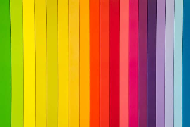
Colour Psychology: What Each Colour Communicates
Red: Energy, Passion, Urgency
Red is the most emotionally intense colour. It conveys energy, passion, danger, and urgency. In sport, red is associated with competitive fire and aggression — teams like Manchester United and Arsenal have built global brands on red’s psychological power. In fundraising, red signals emergency, heart, and life (it is used for blood donation and heart disease campaigns).
Blue: Trust, Calm, Professionalism
Blue is the world’s most universally liked colour. It conveys trust, reliability, calm, and professionalism. Corporate and tech brands overwhelmingly use blue for this reason. In sport, blue suggests control and precision. For charity campaigns related to mental health, water, or ocean conservation, blue is an obvious and powerful choice.
Green: Growth, Nature, Health
Green conveys growth, health, sustainability, and nature. It is the natural choice for environmental causes, health and wellness programs, and organisations with a sustainability ethos. In sport, green signals freshness and endurance. For personal affirmation wristbands, green aligns with growth mindset messaging.
Purple: Creativity, Luxury, Wisdom
Purple has historically been associated with royalty, wisdom, and creativity. In the cause awareness space, purple is used for epilepsy, domestic violence, and Alzheimer’s campaigns. For youth programs and schools, purple conveys creativity and imagination. As a wristband colour, it stands out strongly against skin tones and reads as premium.
Yellow and Orange: Optimism, Energy, Attention
Yellow conveys optimism, warmth, and happiness — it is impossible to ignore and projects positivity. Orange combines the energy of red with the cheerfulness of yellow and is particularly effective for youth and community programs. Both colours draw immediate attention and work well for events where high visibility is important. Explore our custom colour wristbands across the full spectrum.


Matching Your Brand Colours Exactly
Why Colour Accuracy Matters for Brands
Brand colour consistency is non-negotiable for professional organisations. If your brand colour is a specific shade of teal or a precise royal blue, a generic "close enough" wristband in a slightly different shade undermines your brand identity. Colour matching for wristbands requires clear communication between you and your supplier about the exact shade required.
Providing Colour References
Provide your brand colour reference in at least two formats: a Pantone Matching System (PMS) number and a hexadecimal (HEX) code. PMS numbers are the global standard for physical colour matching across different materials and manufacturers. If you only have a hex code (used for digital design), note that silicone materials may not perfectly replicate every digital colour due to inherent material properties.
Cause Awareness Colours: A Quick Reference
If you are designing a charity or cause awareness wristband, using an established cause colour immediately signals your campaign’s purpose to those who recognise it:
Pink — breast cancer awareness. Red — heart disease, AIDS awareness. Purple — epilepsy, domestic violence, Alzheimer’s. Yellow — leukaemia, mental health, suicide prevention. Orange — Multiple Sclerosis, self-harm awareness. Blue — prostate cancer, autism awareness. Green — organ donation, mental illness. Gold — childhood cancer.
See our fundraising wristband options for cause awareness campaigns and bulk charity orders.
Contrast and Readability: Making Text Legible
High Contrast Combinations That Work
The most readable wristband combinations pair light text on dark backgrounds or dark text on light backgrounds. Black text on yellow is the highest-contrast combination possible. White text on navy, dark green, or black reads cleanly. Yellow or white text on red is vivid and attention-grabbing.
Combinations to Avoid
Avoid same-family colour combinations like red on orange, blue on purple, or yellow on green — text becomes nearly impossible to read at a glance. Also avoid very light colour on light background (white text on yellow, for example). If you are uncertain, request a physical sample or digital mock-up before committing to a full order.
Multi-Colour and Segmented Wristband Options
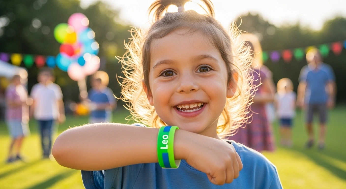
If a single colour feels limiting, consider segmented (swirl) wristbands that blend two or three colours in the same band, or striped designs that layer colours in distinct bands. These are particularly effective for organisations with multi-colour branding, sports teams with two-colour uniforms, or events that want maximum visual impact.
Swirl wristbands create a unique, eye-catching product that stands out significantly from single-colour bands. They are especially popular at events where wristbands are a visible part of the atmosphere rather than simply a functional entry mechanism.
Ready to find your perfect colour combination? Browse our full range of custom silicone wristbands and start your colour exploration today.
Frequently Asked Questions
April 12, 2026

Share on Facebook

Share on X

Share on Pinterest
Comment(s)
Recent Posts