Colour is the first decision people make about a wristband and the one they think least about. It gets chosen from a swatch in ten seconds, and then it has to work across a dark venue, a phone camera, a printed poster and forty different wrists.
This is a practical guide to choosing wristband colours — not what each colour symbolises, but how to pick colours that stay legible, photograph well, and do the job you need them to do.
Start with the job, not the swatch
Wristband colour usually has one of three jobs. Knowing which one you are solving narrows the choice immediately.
Identification — colour as data
Different groups, access tiers or days get different colours. Here the only thing that matters is that colours are unmistakably different from each other under the actual conditions staff will check them. Everything else is secondary.
Belonging — colour as a team
House colours, team colours, a cause. The colour is prescribed and your job is to match it accurately rather than choose it.
Brand — colour as recognition
Corporate colours on a band people wear in public. Accuracy to the brand palette is the whole point — see the branded wristband range.
If colour carries meaning, make the colours far apart
The most common and most expensive mistake is choosing colours that look distinct on a screen and identical at the gate.
Light blue and teal. Orange and red. Purple and navy. On a bright monitor these are obviously different. In a dim venue, on a moving wrist, under coloured stage lighting, checked by someone who has been on the door for six hours, they are the same band.
Pick colours that differ in brightness, not just in hue. A pale yellow against a deep navy stays distinguishable in almost any light because the lightness gap survives when the colour information does not. Two mid-tone colours of different hue will not.
A useful test: view your shortlist in greyscale. If two colours become the same grey, they will fail in poor light. For multi-day event wristbands this single check prevents most access-control problems.
Running tiered access or a multi-day event?
Tell us how many groups you need to separate and we will suggest a colour set that stays readable in low light. Browse event wristbands or the full wristband range.
Tell us how many groups you need to separate and we will suggest a colour set that stays readable in low light. Browse event wristbands or the full wristband range.
How colour affects legibility of the message
The band colour and the message have to work together, and the finish changes the rules.
Debossed and embossed
With no colour fill, the message is the same colour as the band — it reads by shadow alone. That works well on mid and deep tones where the recess casts a visible shadow, and poorly on very pale or very bright colours where there is little contrast to catch.
If you are choosing a pale band and the message must be readable at a glance, budget for colour fill.
Printed
Full contrast control, because the ink is a separate colour. Dark ink on a light band and light ink on a dark band both work. Avoid mid-tone ink on a mid-tone band.
Colours that behave differently than expected
Fluorescents
Brilliant when new and the fastest to shift under sustained sun. For a one-day event they are excellent and highly visible. For a band worn daily for a year, expect the colour to move.
White
Shows marks more than any other colour, especially on bands worn during physical activity. Consider a very pale grey or cream instead.
Glow and UV-reactive
These look ordinary in daylight and do their work in the dark, which makes them genuinely useful for night events — but do not choose them expecting a strong daylight colour.
Matching an exact colour
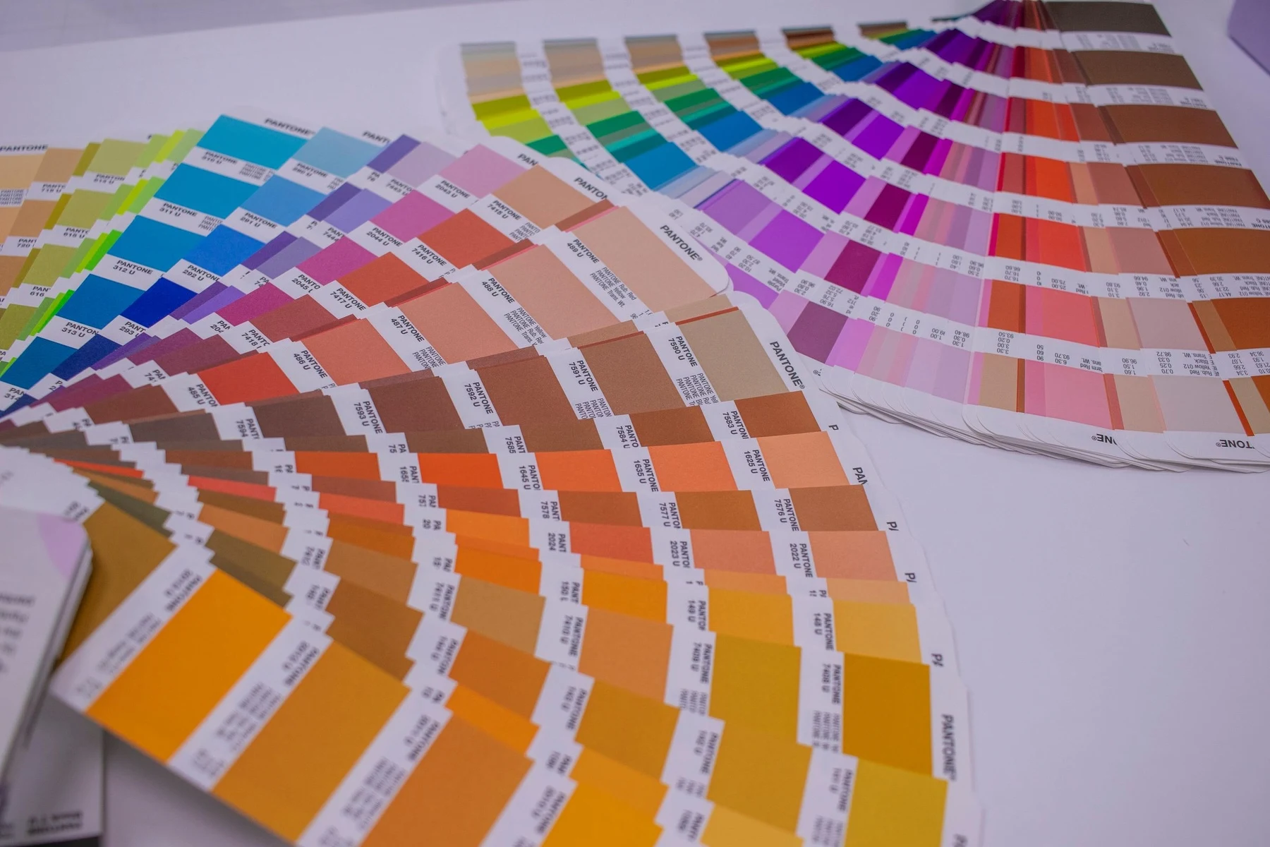
If you are matching a brand palette, a team strip or an existing set of bands, specify the Pantone reference rather than describing the colour. "Our blue" is not a specification; a Pantone number is.
Screens vary enormously — the colour you approve on one monitor is not the colour someone else sees. Working from a Pantone reference removes that variability from the process. If you do not have one, tell us what you are matching to and we will work from a physical reference instead.
Frequently asked questions
How do I choose wristband colours for an event?
Start from the job. If colour separates groups or access tiers, choose colours that differ in brightness as well as hue so they stay distinguishable in dim light. View your shortlist in greyscale — if two go the same grey, pick again.
Which wristband colours are easiest to tell apart in the dark?
Pairs with a large lightness gap, such as pale yellow against deep navy. Avoid combinations like light blue and teal, or orange and red — they read as different on a screen but look identical on a moving wrist under venue lighting.
Do bright wristband colours fade?
Fluorescent and very bright pigments shift fastest under sustained sunlight; deep saturated colours hold longer. For a single-day event fluorescents are ideal for visibility. For a band worn daily over a year, a deeper colour will look better for longer.
Can you match my exact brand colour?
Yes — supply a Pantone reference and we will match to it. Describing a colour or approving it on screen is unreliable because monitors vary. If you do not have a Pantone number, tell us what you are matching and we will work from a physical sample.
What colour wristband shows the message most clearly?
For debossed bands without colour fill, mid to deep tones read best because the recessed letters cast a visible shadow. Very pale or very bright bands give little contrast, so add colour fill if the message needs to be read at a glance.
Colour combinations that work together
If you are choosing a set rather than a single colour, the relationships matter more than the individual choices.
Build the set around lightness first
Choose one clearly light, one clearly mid and one clearly dark before worrying about hue. A set built on lightness separation stays readable in any conditions, and you can then pick hues that suit the brand or the occasion.
Cap it at four or five
Beyond about five colours, reliable separation gets difficult and staff start hesitating. If you need more categories than that, combine colour with another variable — a different width, or printed text naming the tier — rather than adding a sixth similar colour.
Keep the meaning consistent across days
If green meant general admission on Saturday, do not make green mean crew on Sunday. Reusing a colour with a new meaning within one event is a reliable source of confusion.
Colour and accessibility
Around one in twelve men and one in two hundred women has some form of colour vision deficiency, most commonly affecting red and green discrimination. If your colour scheme carries real meaning — access levels, medical information, age verification — a red-versus-green system will be unreliable for a meaningful share of both staff and attendees.
The greyscale test mentioned earlier solves for this at the same time as it solves for poor lighting: colours separated by lightness remain separable regardless of colour vision. Where a scheme genuinely has to use red and green, add a second signal — a printed word, a different width, a different band shape — so colour is not carrying the meaning alone.
Order wristbands in the colours you need
- Custom silicone wristbands — full colour range with Pantone matching
- Event wristbands — colour-coded sets for tiered access
- School wristbands — house colours matched accurately
- Branded wristbands — corporate palette matching
Send us your colours or Pantone references and we will confirm the match. Designed in Sydney, shipped Australia-wide.

Written by
Founder, Handband
Founder of Handband; specialist in custom wristbands and promotional products for events, schools, charities, and brands.
← Previous
Trade Show Giveaways That Actually Generate Leads
Next →
Eagles band together in cancer fight
Comment(s)